In this article :
Which templates are compatible on mobile?
Predrawn and smart templates have been tested with the following mobile platforms:
- iPhone XR, SE 2nd GEN, 11-13 (Mail app)
- iPad PRO (Mail app)
- Android 7.0 et + (Gmail app)
Technologies involved
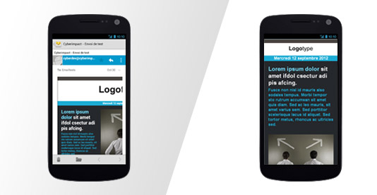
We implemented "media queries" to rearrange and resize content according to the available screen size so that the email won't be truncated (layout which does'nt appear in full and/or with scrollbars in both directions) or resized and becomes difficult to read.
Here is an example of an email before and after the use of media queries:

Mobile preview
Use the "Mobile preview" tool available in our editor to get a quick glance at the display of your email on mobile.
The way to translate "media queries" varies from a phone to an other and an application to an other. We suggest you test your email on different applications and phones before sending your final email.
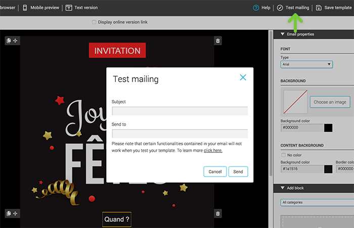
To do so, you can simply use our "Test mailing" tool situated at the top right of the editor and send a preview of your email to a mobile platform.

To get more details about how to test your template, click here.
My phone doesn't show my email in it's mobile version!
Some devices or applications do not support media queries. This means that your email will probably be displayed as if you were viewing it on a desktop screen. This is especially the case when you add an email account that has a different domain than gmail.com in a Gmail app.