Upcoming Maintenance on November 11, 2024: Please note that our service will be temporarily interrupted for some maintenance on Monday, November 11th, 2024, from 10PM to 11:30PM (EST). During this period, the application will be inaccessible and some statistics may not be compiled. Also, some functionalities may be interrupted and any scheduled emails will be sent once the service is restored. We're sorry for any inconvenience this may cause you.
Close

How to keep columns side-by-side on mobile

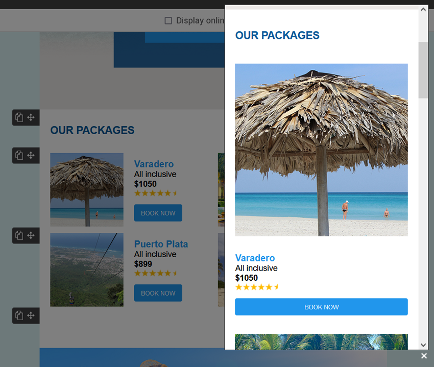
Did you know that our predrawn and smart templates, as well as all templates built with our drag-and-drop editor, are compatible with most mobile devices? In fact, our templates and their blocks are designed to be automatically responsive on this type of platform. By default, rows that have more than one column will transform on mobile so that each of them is displayed one below the other, like this:

Desktop preview

preview-in-browser

Mobile preview in responsive mode

mobile-preview-in-responsive-mode

Since a phone's screen is much smaller than a computer's, this allows for a clear view of the text, images and buttons in each column. 

However, there may be times when, for artistic or strategic reasons, you prefer to keep the columns side by side, even if it reduces the size of the content on mobile. This could be the case to illustrate a table, for example. 

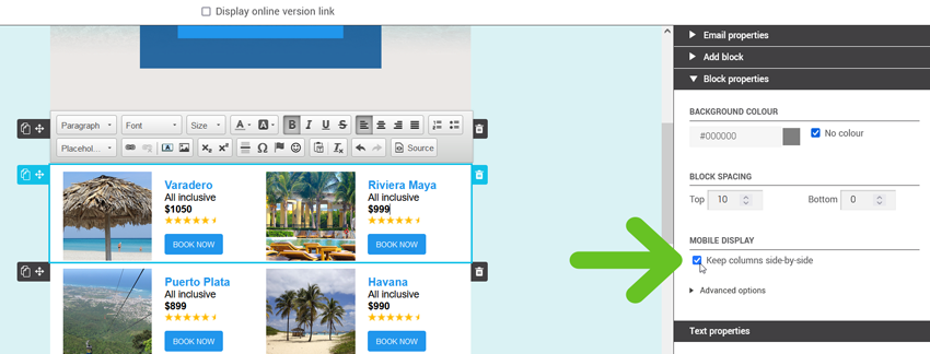
To prevent your columns from being displayed one below the other, simply check the Keep columns side-by-side option found in the Block properties

keep-columns-side-by-side

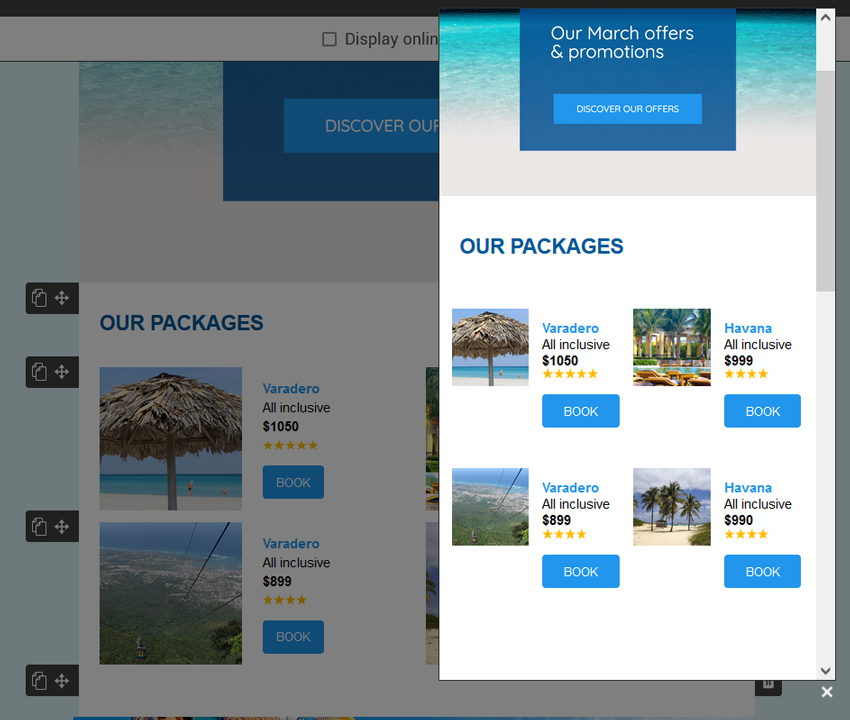
Don't forget to check the result in the mobile preview. You can also send a test email to an email address you have that you can open on mobile. The more columns your block has, the narrower they will be on the mobile screen so that they can be displayed in one row, a word that is too long or a font size that is too big could cause display problems. Take the time to test your email

mobile-preview-with-columns-side-by-side

Top